From 120Cr to 300Cr annually: The unification journey of an enterprise platform


Vodafone Idea (Vi) is one of India's largest telecom operators, serving millions of prepaid, postpaid, and enterprise customers across urban and semi-urban India. Beyond telco, their services expand into Sim based connectivity, IoT, WiFi, managed circuits and other enterprise offerings.
Vi's enterprise admins managed two disconnected platforms: one for SIM mobility and one for non-SIM products with only partial digital surface. Internally, they were managed by different teams with different design approaches. We reframed the problem. Consolidated both into ViBA: a single platform with unified workflows, real-time payment confirmation, and a scalable design system. Online collections grew 3x. It changed how Vi’s enterprise leadership thought about their digital portfolio.
• Enterprise UX Design
• Product Strategy
• Design Systems
• Systems Architecture
• Data Analysis



Focusing on what users actually do.
Design decisions required buy-in from business, development, and solution architecture simultaneously. Rather than designing in isolation and presenting for approval, Pineapple ran 20+ structured discovery sessions upfront, building shared understanding before a single screen was drawn

Wayfinding, by design.
FLX was digitized from scratch. ViBM was redesigned. Then both were merged into ViBA. Current amount due, pending approvals, service requests, and connection status now sat on a single surface. The Mobility/FLX toggle at the top was introduced to switch product contexts without exiting from the platform.
Focusing on what users actually do.
Design decisions required buy-in from business, development, and solution architecture simultaneously. Rather than designing in isolation and presenting for approval, Pineapple ran 20+ structured discovery sessions upfront, building shared understanding before a single screen was drawn
Wayfinding, by design.
FLX was digitized from scratch. ViBM was redesigned. Then both were merged into ViBA. Current amount due, pending approvals, service requests, and connection status now sat on a single surface. The Mobility/FLX toggle at the top was introduced to switch product contexts without exiting from the platform.
Data prioritization
We implemented 500+ analytics tags during the launch. This meant Vi had journey-level performance data from day one. This data directly informed subsequent optimization.
Focusing on what users actually do.
Design decisions required buy-in from business, development, and solution architecture simultaneously. Rather than designing in isolation and presenting for approval, Pineapple ran 20+ structured discovery sessions upfront, building shared understanding before a single screen was drawn
Wayfinding, by design.
FLX was digitized from scratch. ViBM was redesigned. Then both were merged into ViBA. Current amount due, pending approvals, service requests, and connection status now sat on a single surface. The Mobility/FLX toggle at the top was introduced to switch product contexts without exiting from the platform.
Data prioritization
We implemented 500+ analytics tags during the launch. This meant Vi had journey-level performance data from day one. This data directly informed subsequent optimization.
Twenty-five patterns became one
ViBM had 25+ service request types, each with a unique workflow. The partner assumed this was necessary because each request type was different. Pineapple showed that the structural pattern was identical. This standardization collapsed per-feature inconsistency and cut future feature delivery time from 2 weeks to 3 days. It was not a design decision, but a product architecture decision.
Focusing on what users actually do.
Design decisions required buy-in from business, development, and solution architecture simultaneously. Rather than designing in isolation and presenting for approval, Pineapple ran 20+ structured discovery sessions upfront, building shared understanding before a single screen was drawn
Wayfinding, by design.
FLX was digitized from scratch. ViBM was redesigned. Then both were merged into ViBA. Current amount due, pending approvals, service requests, and connection status now sat on a single surface. The Mobility/FLX toggle at the top was introduced to switch product contexts without exiting from the platform.
Data prioritization
We implemented 500+ analytics tags during the launch. This meant Vi had journey-level performance data from day one. This data directly informed subsequent optimization.
Twenty-five patterns became one
ViBM had 25+ service request types, each with a unique workflow. The partner assumed this was necessary because each request type was different. Pineapple showed that the structural pattern was identical. This standardization collapsed per-feature inconsistency and cut future feature delivery time from 2 weeks to 3 days. It was not a design decision, but a product architecture decision.
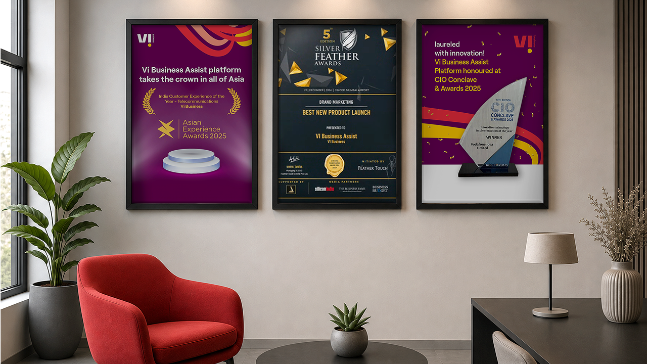


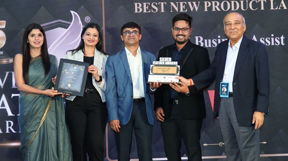
2. Asian Experience Awards ‘25 for India Customer Experience of the Year – Telecommunications (Vi Business)
3. Innovative technology implementation of the year at the 10th CIO Conclave & Awards ‘25